This type of chart is used to provide a time series chart based on the interval selected. The chart can be configured to be stacked and multiple axes can be configured per stack. Measures of the same interval type can then be configured to be displayed on each axis, with multiple configuration options per measure.
A Time Series chart consists of the following groups:
General
The General tab is used to define the layout of a table as well as the default period display and which indicators to display by default. The General tab consists of Chart, Title and Period.
Chart
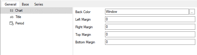
Under the Chart section we have the following properties:
|
This sets the color of the background area that surrounds the chart. The default is the “Windows” theme color. |
|
This sets the padding to the left of the chart. The default is 0. |
|
This sets the padding to the right of the chart. The default is 0. |
|
This sets the padding to the top of the chart. The default is 0. |
|
This sets the padding to the top of the chart. The default is 0. |
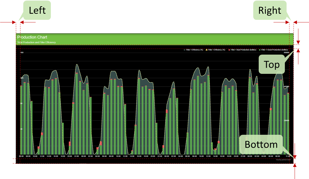
The figure below shows the effect of updating the above properties for a Time Based Chart. The properties are annotated to demonstrate the effect of each of the properties on the chart.
Title
Refer to the general “Title” chart properties section for more information.
Period
Refer to the general “Period” chart properties section for more information.
Base
The Base Axis provides the capability to edit the display properties of the x-axis (Time Axis).

The Base Axis has the following configuration settings:
Base Axis
Base axis settings include the way formatting and scaling will be applied to the axis. Below is a list of the base axis properties:
|
This sets the Base Axis’s title text. |
|
This is used to configure the color of the font of the axis. |
|
This is used to configure the size of the font of the axis. |
|
This is used to determine if the value label of the axis should be displayed or not. |
|
This is used to rotate the values on the value axis if the label is visible. |
|
|
|
|
Measure

Series and Stacks
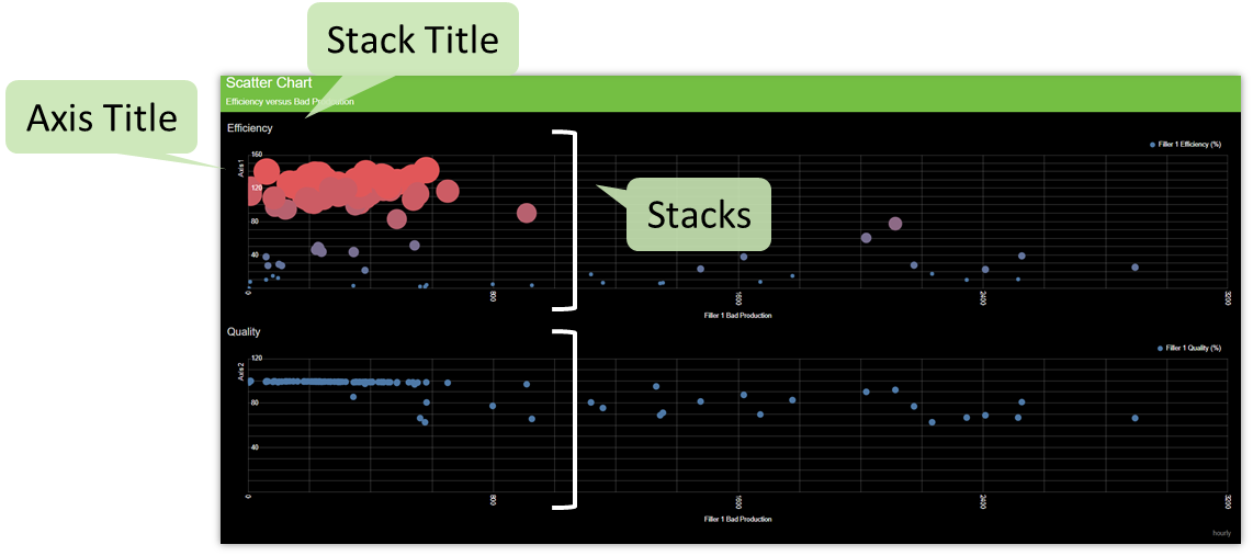

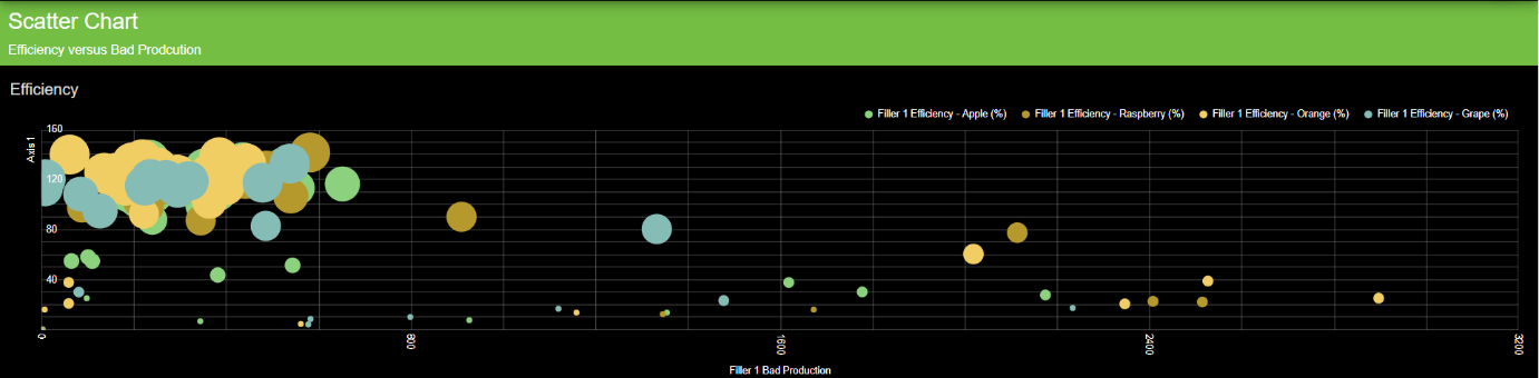
Series have the capability to plot variables against the base measure. Multiple “stacks” can be added to plot scatter charts stacked on top of each other but with the same base measure. Multiple measures can also be added to a stack. Stacks can be added, removed and reordered in the Series tab. Stacks have the following properties:
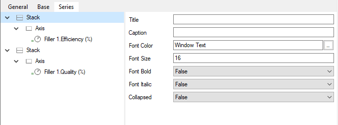
|
This sets the stack’s title text. |
|
This sets the caption text to 60% of the size of the main title’s font. This text is displayed below the title. |
|
This sets the font color of the stack’s title text. |
|
This sets the size of the stack’s title text. |
|
This sets whether the text in the title cell is bold. |
|
This sets whether the text in the title is italicized. |
|
This determined whether a stack is collapsed by default. Even if the stack is collapsed, it can still be expanded/collapsed by clicking on the stack title. |
Axis
One axis can be configured per stack. An axis can be configured with the following properties:

|
This sets the stack’s title text. |
|
This is used to autoscale the values on the base axis. Alternatively, fixed scale values can be supplied. |
|
This will always include zero on the base axis. If not included, the minimum value of the axis will be the smallest value in the dataset. |
|
This is used to configure the color of the font of the axis. |
|
This is used to configure the size of the font of the axis. |
|
This is used to determine if the value label of the axis should be displayed or not. |
|
This is used to rotate the values on the value axis if the label is visible. |
Measures
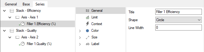
General
The General section is used to set the title of the measure as well as the shape and line width of the points plotted on the chart. The default title for the row is set to the measure’s name and can be overwritten.
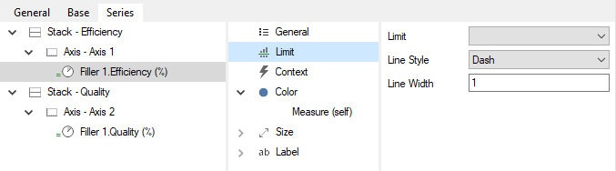
Limit
The Limit section is used to configure which measure limit is to be displayed on the chart. The line style and width can also be configured.
Context
The Context section is used to configure additional context to be added to the plotting surface. This context is linked to an event scheme that is configured on the measure itself.
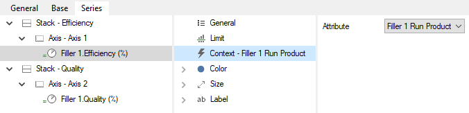
The event attribute colors will be used as a provider to change the color of the points as per the different colors of the event attribute.
Color
The Color section is used to configure the measure’s data point colors and behavior. The base color can be set when clicking on the Color item. Base color is a static color used for the cell background colors. Opacity sets the opacity of the cells, and defaults to 0. It is possible to add the following color providers:
|
This color provider will generate a heatmap based on the value of the measure linked to it. By default the measure that represents the row is the linked measure. |

The Measure Color Provider has the following properties:
|
This color is used for the background of the cell if the value of the source measure is towards the lower end of the scale. |
|
This color is used for the background of the cell if the value of the source measure is towards the higher end of the scale. |
|
This is used to specify how the colors are distributed between the Low Color and the High Color. If this value is 0 it means that the colors will be mixed together in an infinite number of steps. |
|
This is used to determine the scale. If it is automatic, the scale is calculated based on the range of values of the source measure, otherwise the Low and High values must be specified. |
|
This will mix in to the color range, the base color for the row if it is set to true, if the value is in the middle of the scale’s range, the background color will be set to the base color. |
To change the source measure of the Measure Color Provider, it must be created first and then another measure can be dragged onto it.
Size
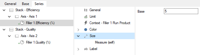
The Size section is used to configure the measure’s data point size. The base size can be set when clicking on the Size item. It is possible to add the following size providers:
|
This size provider will generate a size map based on the value of the measure linked to it. By default, the measure that represents the point is the linked measure. |
The Measure Size Provider has the following properties:
|
This is used to change the size of the data point to the smallest size if the value of the source measure is towards the lower end of the scale. |
|
This is used to change the size of the data point to the biggest size if the value of the source measure is towards the higher end of the scale. |
|
This is used to specify how the sizes are distributed between the Low Size and the High Size. |
|
This is used to determine the scale. If it is automatic, the scale is calculated based on the range of values of the source measure, otherwise the Low and High values must be specified. |
To change the source measure of the Measure Size Provider, it must be created first and then another measure can be dragged on to it.
UI Interaction
Additional functionality available in a Table report includes:
|
Clicking an individual cell will open a Drilldown overlay providing details of that measure value (calculation inputs, comments and versions). |