
Pareto Charts are generally designed to visualize the 80/20 principle named after Vilfredo Pareto. The 80/20 principle outlines a method to highlight the most significant factors in a collection of datapoints, categorized by a set of factors that may be vast.
Most common uses are to look at outliers of points that are the main contributors of a certain factor, for example, which product was produced the most during the week or which downtime>>>>
The Pareto chart consists of the following groups:
General
The General tab is used to define the general layout of a table as well as the default period displayed and which indicators to display by default. The General tab consists of Chart, Title and Period.
Chart
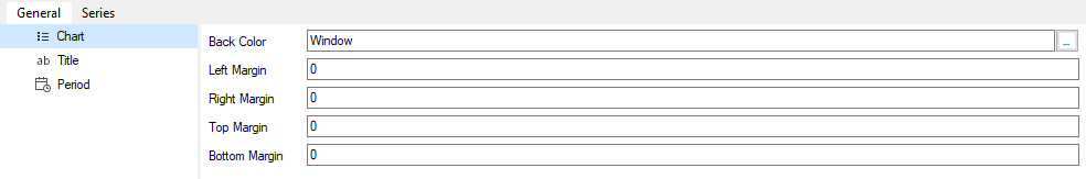
The Chart section has the following properties:
|
This sets the background area that surrounds the chart’s color. The default is the “Windows” theme color. |
|
This sets the padding to the left of the chart. The default is 0. |
|
This sets the padding to the right of the chart. The default is 0. |
|
This sets the padding to the top of the chart. The default is 0. |
|
This sets the padding to the top of the chart. The default is 0. |
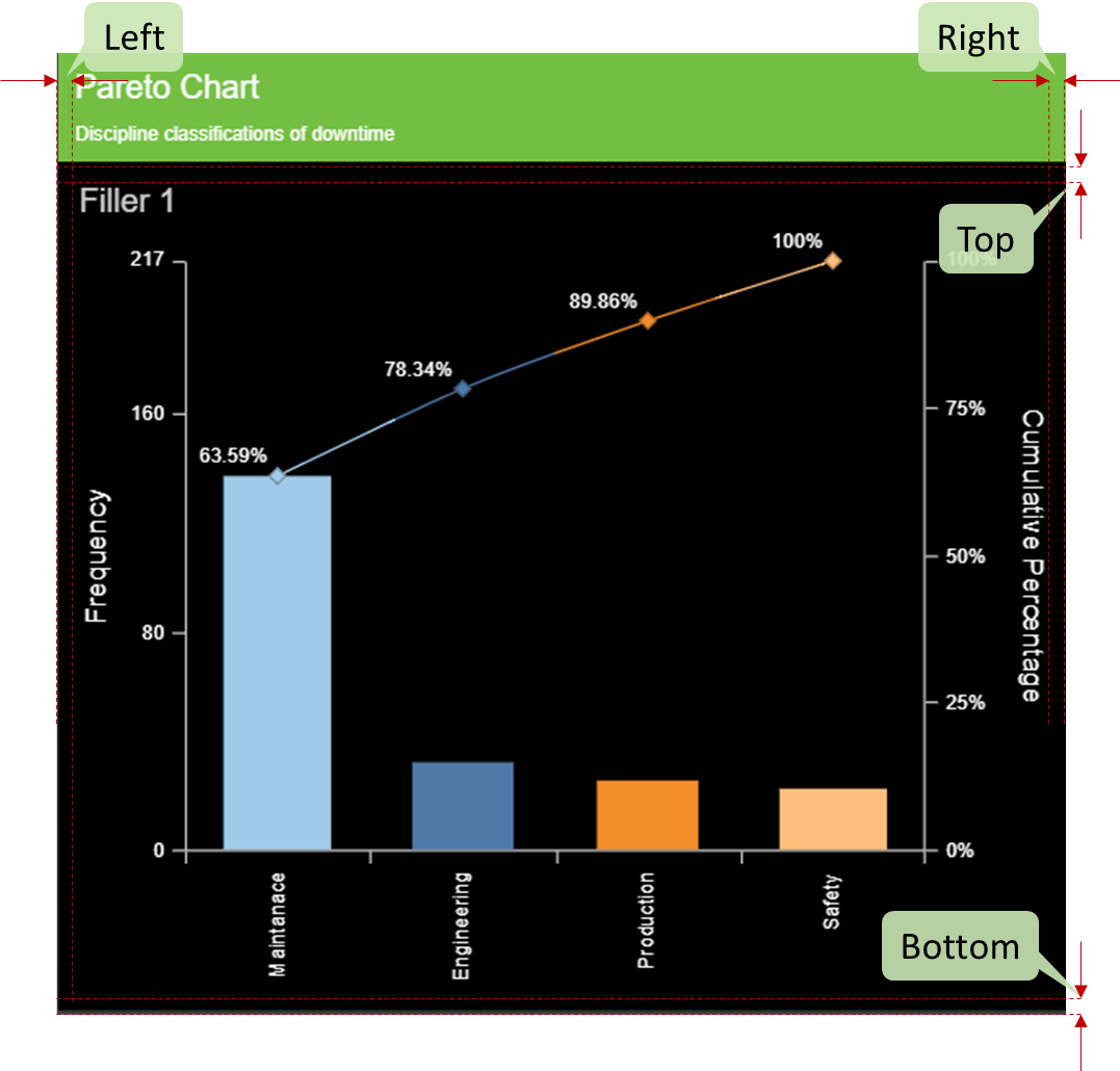
The figure below shows the effect of updating the above properties for a Pareto Chart. The properties are annotated to demonstrate the effect of each of the properties on the chart.
Title
Refer to the general “Title” chart properties section for more information.
Period
Refer to the general “Period” chart properties section for more information.
Series
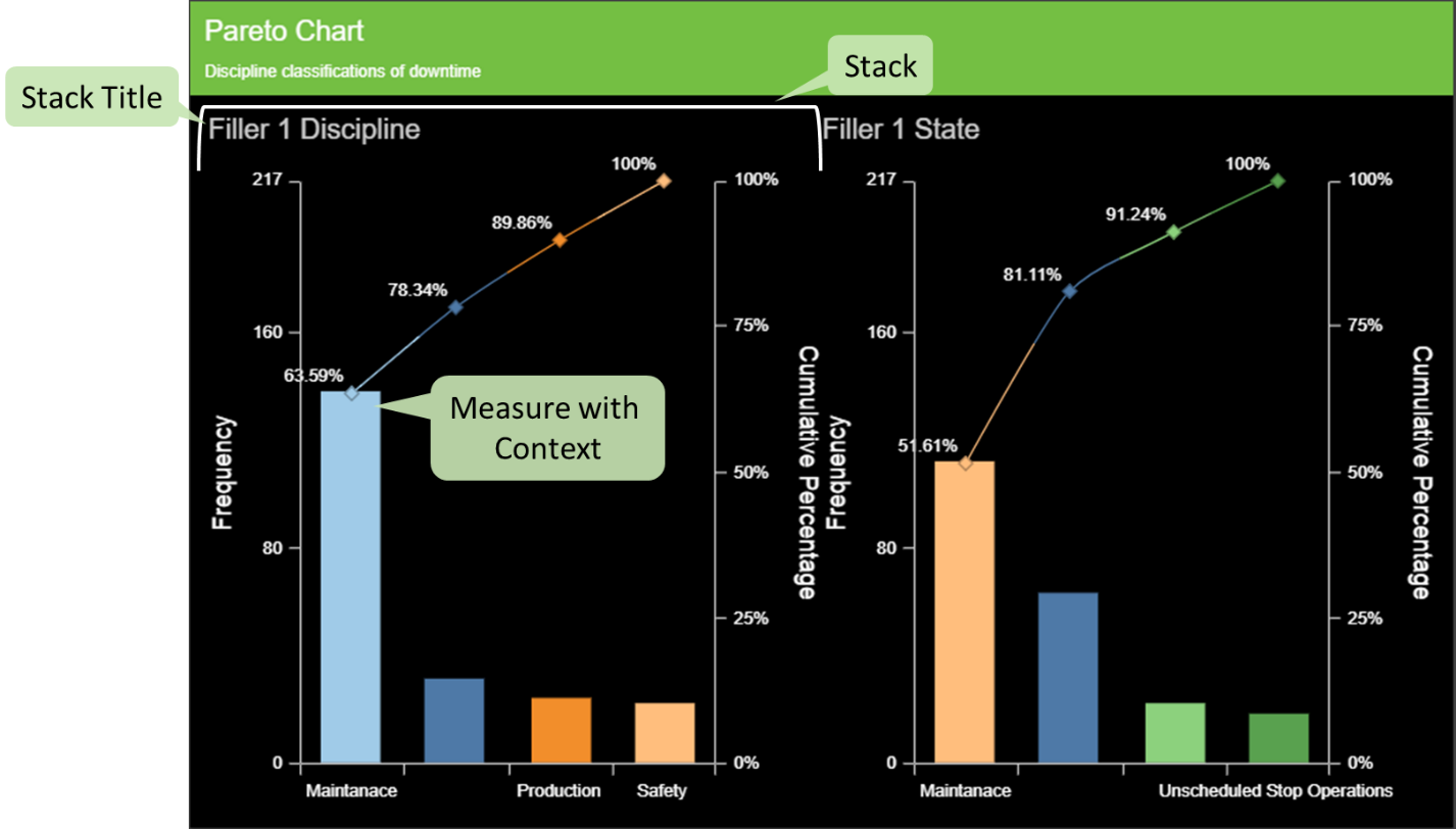
Series are used to group related information together by means of creating “Stack” groups of measures on top of one another. The Series tab is used to configure these stacks. Stacks can be added, removed and reordered in the Series tab. Stacks have the following properties:
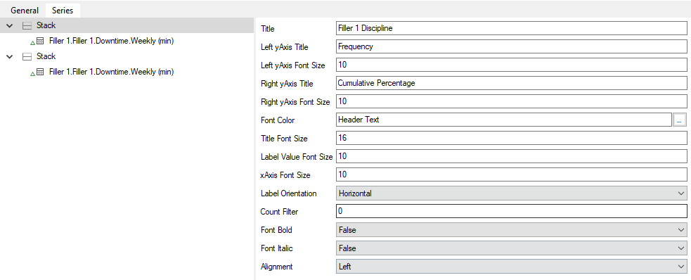
|
This sets the section’s title text. |
|
This sets the title of the left axis of the Pareto. |
|
This sets the font size of the left axis title. |
|
This sets the title of the right axis of the Pareto. |
|
This sets the font size of the right axis title. |
|
This sets the font color of the section’s title text. |
|
This sets the size of the stacks’s title text. |
|
This sets the size of the value label. |
|
This sets the size of the xAxis label font. |
|
This sets the orientation of the xAxis label, either horizontal or vertical. |
|
Top “N” functionality: Count of the number of Pareto bars to be displayed. |
|
This sets whether the text in the title cell is bold. |
|
This sets whether the text in the title is italicized. |
|
This sets whether the text in the title is aligned left, center or to the right. |
Measures
Measures of the same interval type as the chart can be added to a section by dragging it from the Model View onto a stack. Multiple stacks can be configured and added. Measure layout configuration on the chart is defined by the following sections:
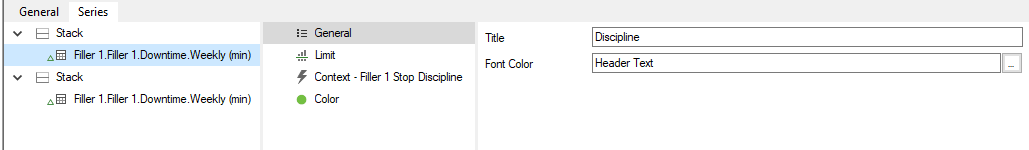
General
The General section is used to set the title of the measure’s row as well as if the row uses bold text or if the row is italicized. The default title for the row is set to the measure’s name and can be overwritten.
Limit
Context
The Context section is used to configure additional context to display on a measure row. This context is linked to an event scheme that is configured on the measure itself. Each event attribute measure value will be displayed on its own bullet chart.
The color of each bar will be based on the color associated to the different attribute values.
Color
Note: The color of the Pareto Bars will be based on the attribute colors specified in the attribute section for the specific event configured.
UI Interaction
Additional functionality available in a Table report includes:
|
Clicking an individual bar will open a Drilldown overlay providing details of that measure value (calculation inputs, comments and versions). |